India is in a great need for new technology. Most of the potential users in India are unfamiliar with many apps or websites which the western user takes for granted. The technology that should be developed in India should be secure, easily available and easy to use. The cash App that I’m developing is in accordance with those goals and provides new, flexible, faster and secure way of payment inside every “BuyCycle” franchise shop.
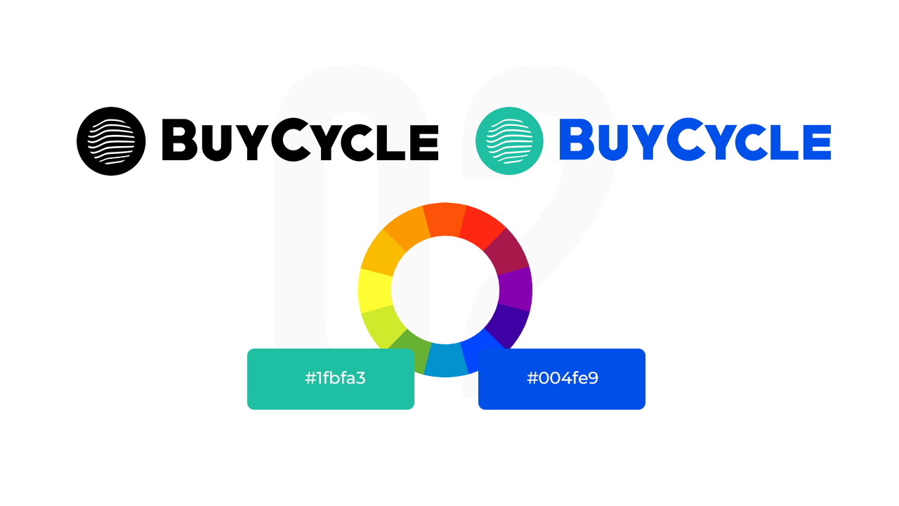
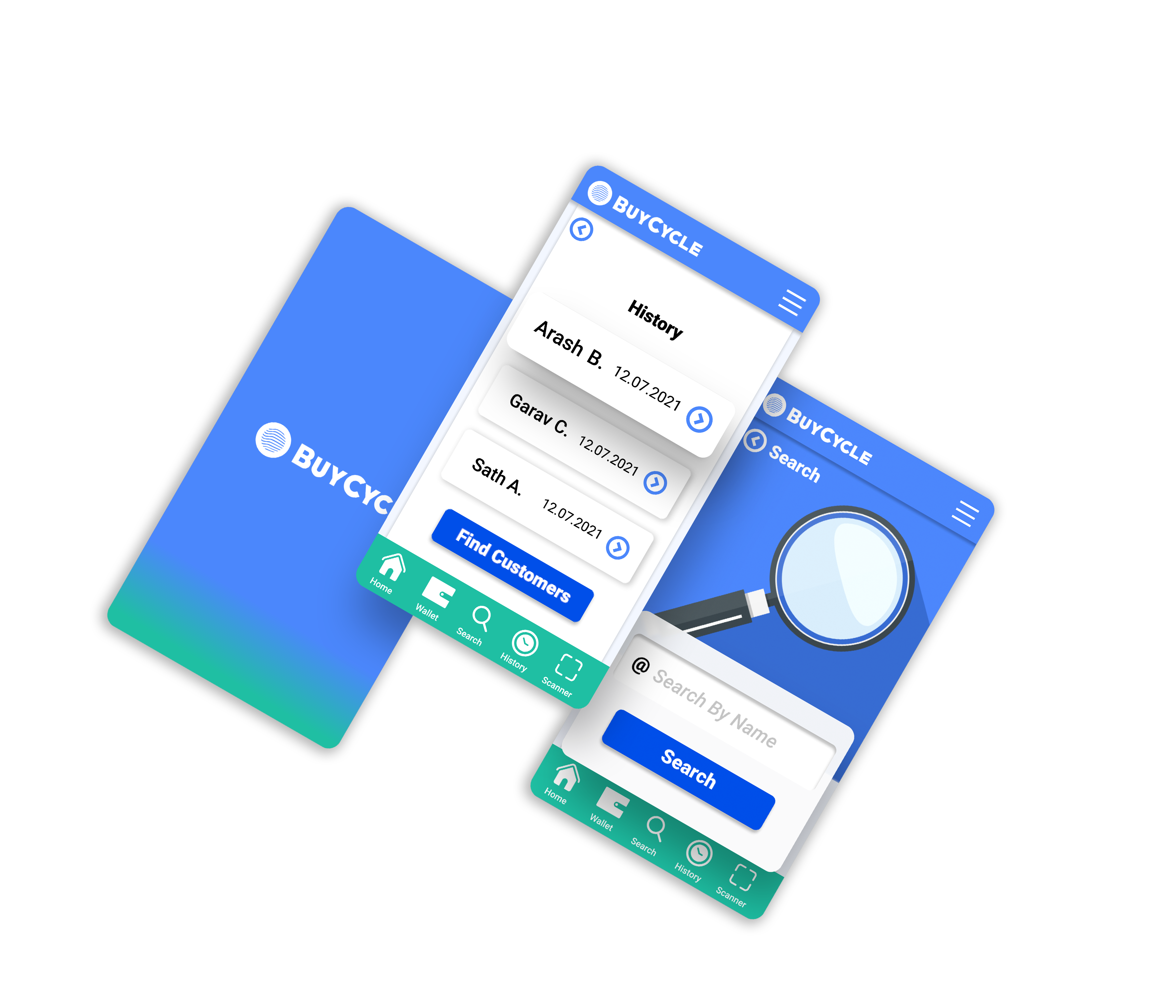
Logo
After a research I came to the conclusion that the most important part of a bicycle is its tires. That’s one of the reasons why I chose to make the logo for this cash app in a way that resembles a bicycle tire. The other element of the logo conveys messages like movement and digital technology.
Since one of the main problems of Cash register apps in India is the payment security. I decided to use a shade of the color blue. The color blue is used when conveying stability, trustworthiness and security.
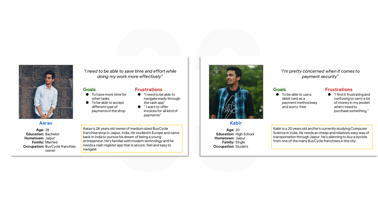
Personas
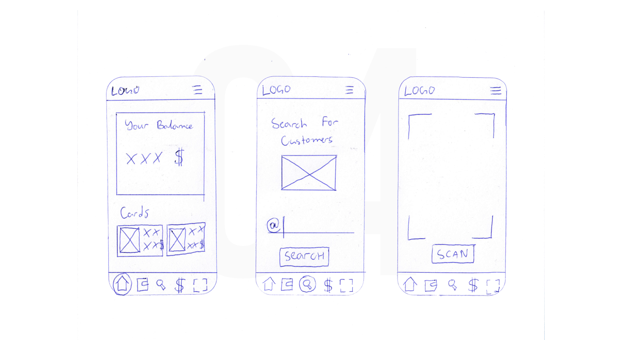
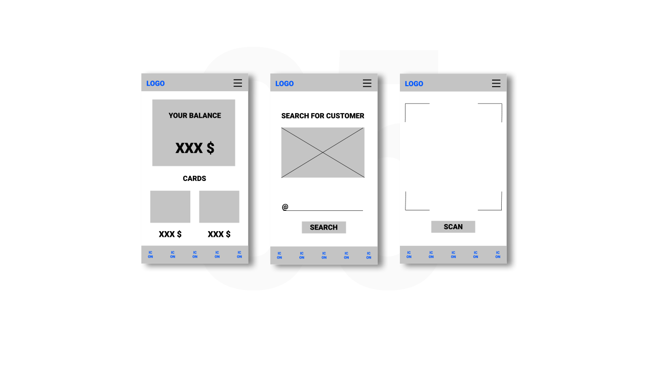
Personas are created by conducting user research and identifying common pain points, which are UX issues that frustrate and block the user from getting what they need from a product. Paper wireframes are a great way to start designing a product. They may look a little bit ugly, but that's okay. Drawing those kind of wireframes on a piece of paper is similar to rough sketching. I decided to combine the characteristics of 3 apps - Luca, Cash App and Barcode Scanner. There are 2 User flows - one for the seller and one for the customer. Supporting evidence from usability study.
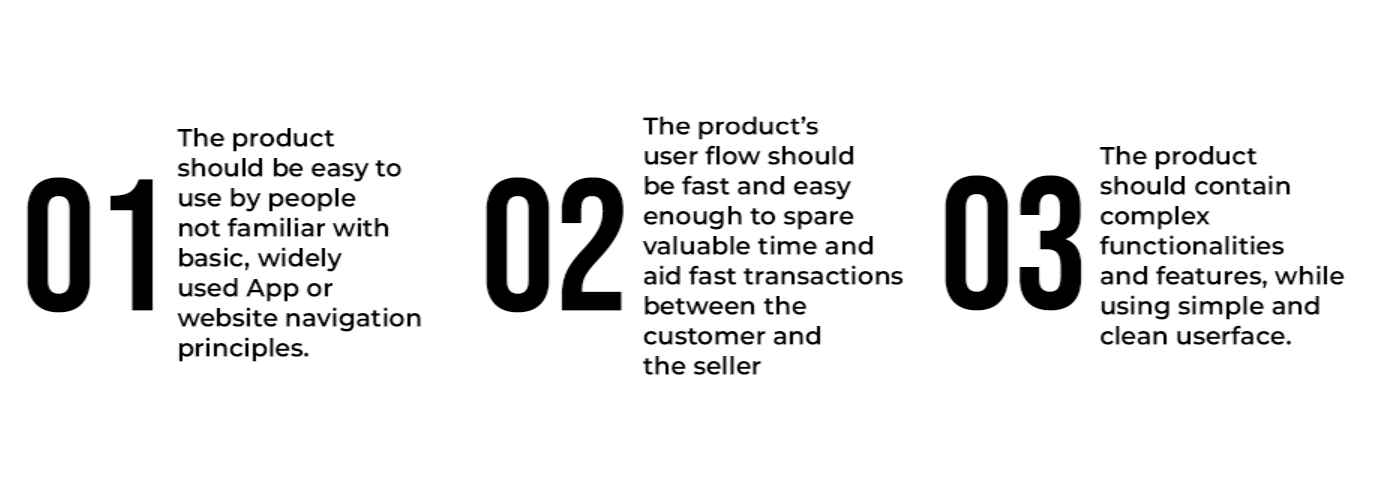
● Since most users will be unfamiliar with navigating through complex apps, I decided to design the main navigation in a way that is always visible, on every screen of the seller’s user flow.
● The navigation’s bar menu icon will be used for more complex tasks, such as changing image, changing password or managing profile settings.
● The app will be used in a environment where people are unfamiliar with modern technology. Certainly it will be hard for most users to understand where to go and where they are in the journey. That’s the main reason why titles should be added to the main navigation and the use of icons instead of text should be greatly reduced.
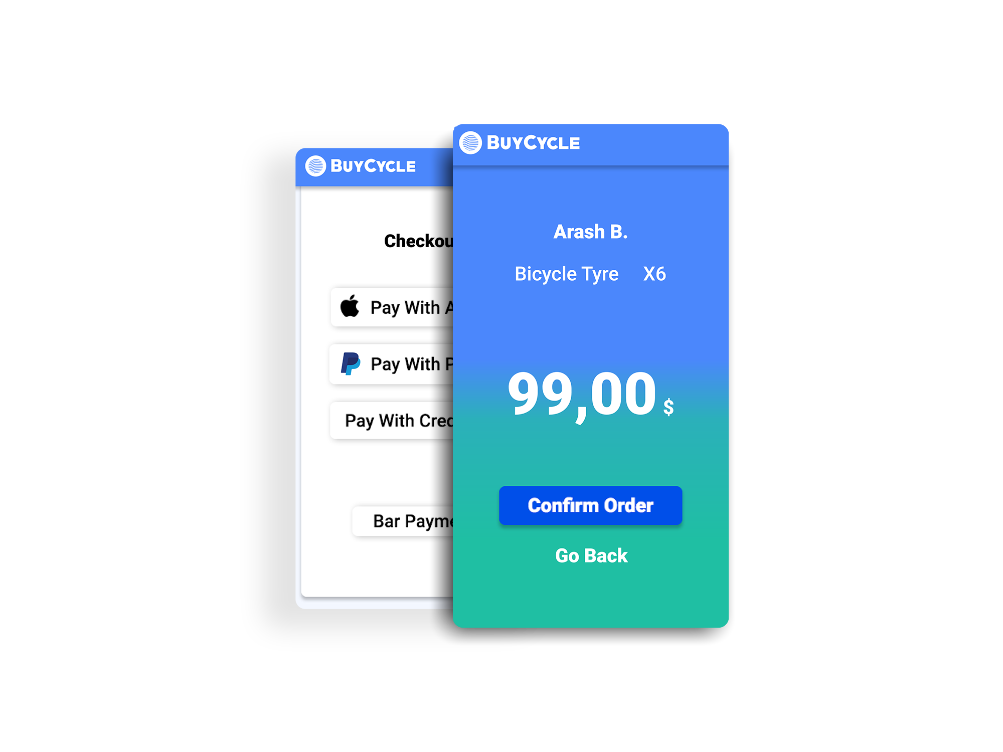
Customer User Flow
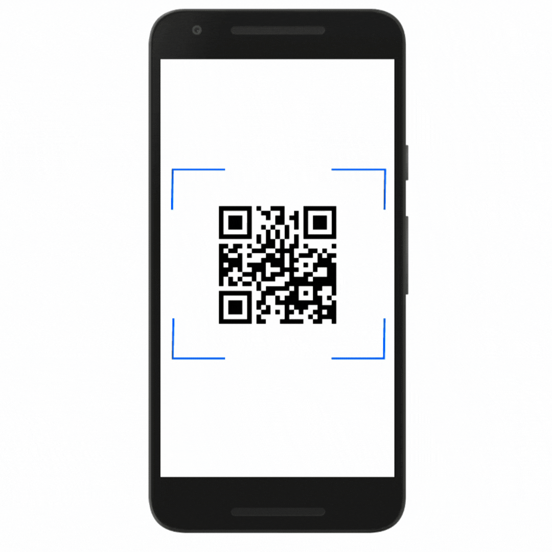
The Customer use his phone's QR code scanner and is redirected to the first screen of the app. He then creates his user profile following the steps. At the last registration screen, he confirms his credentials and has now created his account.After he goes to the cashier's counter, the seller looks for his account through the app's search function and sends an email invitation. The customer is able to pay for his purchase with PayPal, Apple ID, Credit Card or in cash. After he completes the payment process, he receives the invoice through his user email.
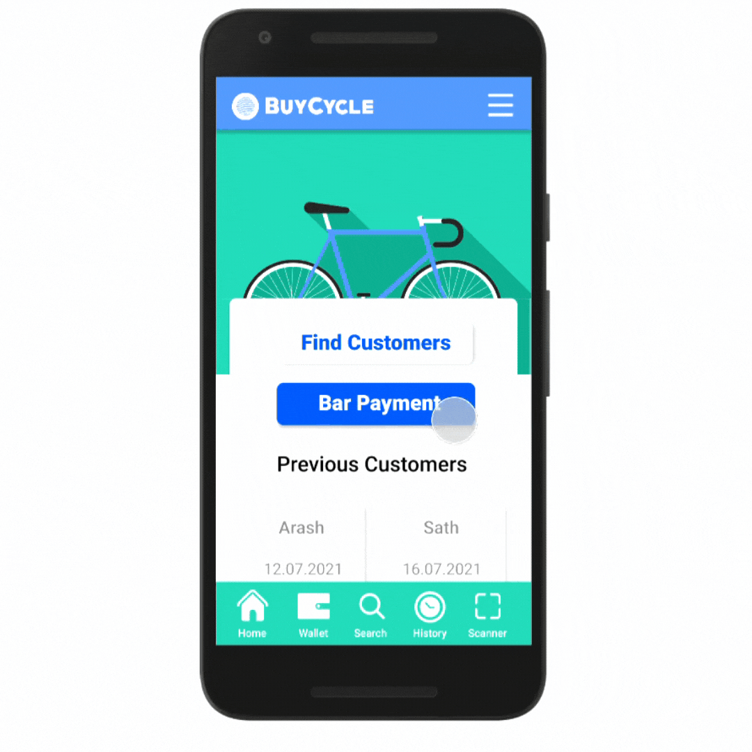
Seller User Flow
Firstly the seller finds the customer's account throughout the search functionality of the app. He then has the possibility to scan a product from the shop (which automatically calculates the price and the taxation in the app) or to receive bar payments. After the calculation is done and all the products are scanned he confirms the order and the customer receives automatically an email, containing his invoice, guarantee etc. The customer is saved in the app's history, which helps for taxation and if there are going to be any returns to the store.
Conclusion
After the final testing of the product, I came to the conclusion that all of the product expectations are met and there's room for many additional functionalities. Probably the first additional feature that could be integrated into the product is the ability to calculate coupon codes or scan gift cards. There's also a lot of room for more upgrades especially during the Covid-19 Pandemic - like booking hours for shopping or ordering not available bicycle parts throughout the application. Thank You
©2021
Cash Register App